Lately organ facades have been designed following such rigid geometric criteria or so fully incorporated in the overall design of the room that they are no longer perceived as separate entities. Or, on the other hand, they are arranged to give such a futuristic impression that you almost wouldn’t think you were looking at an organ. Have a look at the following pictures – all of them are actually plain and simple organs.

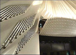
E, Santa Cruz, Auditorio de Tenerife
(Blancafort, 2005)
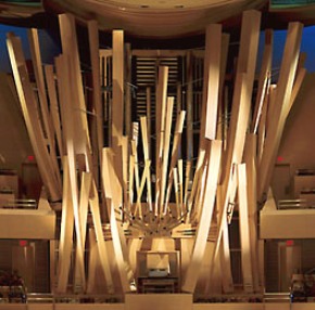
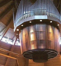
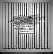
Below to the left you have what is probably the messiest organ facade in the World, arranged in a concert hall with an equally interesting interior design, next to it a «space organ», a merry-go-round type of thing dangling from the ceiling of the chapel, next an organ following the idea of «the handy chocolate square» (with only the Spanish Trumpets poking out). Then there is the organ made from glass and steel only and finally to the right you have a literally «handy» organ:

USA, Los Angeles.
(Glatter-Götz & Rosales, 2004)
As you saw in the picture of St. Peter’s in Cologne Spanish trumpets are a very popular element of design. Especially in North American organs they are a real «must». Often they are overblown and arranged separately on the main organ facade, or they are placed in a so-called antiphonal organ on the other end of the church (actually, some antiphonal organs consist of only this one stop).


Leave a Reply
Lo siento, debes estar conectado para publicar un comentario.