Copio aquí este artículo de John Kannenberg sobre los mapas sonoros:
Sound Maps in the 21st Century: Where Do We Go From Here?
Sound maps are boring. Why? I would argue it’s because they’ve become stuck in a rut that began when the idea of ‘sound map’ became synonymous with online, Google API-based or other forms of point-and-click, CD-ROM era interface design. If we want sound maps to become less boring, this needs to stop. But how do we as sound artists (or would-be ‘sound cartographers’) break free of the point-and-click model?
In an attempt to answer this question, I’ll need to first briefly explore what cartography is as a practice, limiting this to a discussion of strictly locative maps for brevity’s sake. I’ll then need to surmise what the possible motivations behind the creation of sound maps might be.
According to Wikipedia’s sloppy, highly opinionated, but almost kind of accurate entry, we are led to believe that sound maps are currently ‘digital geographical maps that put emphasis on the sonic representation of a specific location.’ However, if we look at the history of the term, the first sound maps were not, in fact, digital, and neither were they interactive; so the next discussion below will cover the origin of sound mapping as a practice.
Fast-forwarding to the 21st Century, I’ll finally discuss why I believe the current state of sound mapping is facing a dead end, and propose a simple solution for addressing some of the inherent problems I see within current sound maps.
What is Cartography?
Cartography is the creation of maps. It is a discipline and practice that collects geographical information, prioritises it, and presents an edited version of that initial information in the form of the thing that we call a map. Like all art forms that rely on a process of abstraction, cartography is an art of editing and emphasis. The action of removal, of editing, of prioritisation, is crucial to the essence of a map.
If we look at the word ‘abstract’ as a verb instead of an adjective, the word’s relation to cartography becomes clearer. The verb ‘abstract’ means ‘to draw away, withdraw, remove’. It was originally derived from the Latin word abstractus, meaning ‘drawn away,’ the past participle of abstrahere ‘to drag away, detach, pull away, divert’.
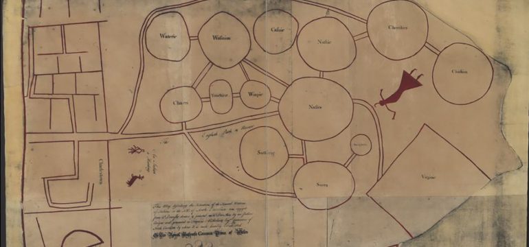
Abstraction is, therefore, selection; it is the stripping away of the unnecessary and the emphasising of the essential. How this relates to perceived reality is different for every cartographer and cartographic project, in many ways informed by the culture within which the cartographer exists. There is a massive difference between, for sake of brief example, the globes produced in Europe during the Enlightenment, Native American maps of the 18th Century, the iconic London Underground map, and the online, Google-type maps of the 21st Century. All of these are abstractions of reality, all of them represent reality differently. Cartography is as much about personal interpretation as it is about the representation and translation of reality into an easily digestible, two-dimensional form.
To look at two of the above examples in slightly more detail, if we look at cartography from a usability perspective, then Harry Beck’s original London Underground map is the ultimate example: eschewing realistic proportions yet devising realistic feeling relationships, the Tube map effectively and quickly communicated what its viewer needed most: how to get from point A to point B.
If we look at cartography as an art of personal interpretation, then Native American maps are the clearest example. Like the Underground map, these maps eschewed realistic proportion and emphasised importance via unrealistic size and proximity relationships, making important things larger than they are in reality, and representing paths as simple connections rather than elaborately winding roads.
Why Sound Maps?
What are the motivations behind the making of a sound map – or more correctly, what can be inferred about the reasons one might undertake the creation of a sound map? To answer this, two areas must be explored, the first being a more precise explanation of why traditional visual maps are made.
Visual maps are attempts to document the experience of movement through a landscape, establishing locational relationships between a myriad of select real-world destinations or landmarks. Maps traditionally have been two-dimensional graphic representations of the three-dimensional world. They help their users establish priorities when traveling, based upon places they need to go to or that they want to see. Traditional graphic maps combine visual and textual symbols to communicate where things are in order to facilitate movement throughout the third dimension.
The second area of exploration involves why practitioners and researchers might be motivated to create ‘sound-specific’ analogues of previously visual-centric practices. Most Sound Studies texts usually contain a variation on the statement ‘the tyranny of the visual’: the notion that so-called Western culture, being so long beholden to visual information rather than sonic, taste, touch, or smell, is in need of redressing this balance, and those who are interested in sonic experience concoct various ‘sound-versions’ of traditionally visual things in order to help do so (i.e. ‘sound sculpture’, ‘sound drawing’, ‘sound installation’, ‘sound art’, ‘soundscape’, ’sonic architecture’, etc.). Practitioners often attempt to achieve this rebalancing act by foregrounding the sonic and backgrounding the visual. In effect, they shift the emphasis, changing the primary access point for the viewer/auditor from a visual one to a sonic one. So for sound maps to follow a similar model to other modes of sonic-foregrounding practices, it seems logical to suggest that they focus on the sonic experience of place.
How did sound maps begin?
The World Soundscape Project, initiated in the 1960s at Simon Fraser University in Vancouver by a team of field recordists who organised themselves around the work of composer and anti-noise pollution advocate R. Murray Schafer, began collecting recordings of what Schafer named ‘soundscapes’ – the sonic equivalent of landscape – and analysing the sounds heard by designating them on visual maps during their project that resulted in the publication of their European Sound Diary in 1977.
In 1982, New Zealand composer and sound artist Annea Lockwood was commissioned by the Hudson River Museum to create a sound installation. The resulting two hour sound piece entitled A Sound Map of the Hudson River consisted of field recordings of locations along the Hudson interspersed with oral histories she collected as told by the inhabitants along the riverbanks. It was a linear, composed tape piece which foregrounded sound as the primary user experience; a visual map was installed on the wall of the gallery where it was presented, but the sounds heard were the primary focus, free of user interaction. This was the work of a cartographer, presenting her own lived map of a location, edited from hours of source material into a two hour long experience.
21st Century Sound Mapping: from dead end to new beginning
Sound maps in the 21st Century have almost exclusively shifted to an online, point-and-click interface, either using the Google Maps API or another custom-coded visual interface. They are rarely the creation of a single cartographer; rather, they usually consist of the work of multiple contributing recordists, often open to public contribution. Rather than material that is selected from a larger body of recordings, these maps often are unedited in any way, essentially presenting an entire archive of recordings with a clickable map or map-like interface. They are exhaustive, archiving the specific sounds of specific locations at specific times, and will be extremely useful for reconstructing the ambient sounds of various locations across the planet for future generations. But are they actually ‘sound maps’? Does the experience of using a point-and-click sound map really achieve the redressing of the balance between the sonic and the visual that one would expect from something that calls itself a ‘sound map’?
Sound maps based upon a point-and-click interface emphasise the importance of the archive over the importance of the cartographer’s relationship to the material. In their obsession with integrating user choice, these types of sound maps abandon the tradition of cartographic interpretation. The archive is the thing, instead of a specific interpretation of the material via a cartographer who seeks to communicate the sonic relationships that exist within the place being mapped. A sound map that asks its user to read a list, or look, or click a link in order to access its audio is simply using its audio to illustrate another form of interpreting the world, i.e. the text or image clicked on. The sounds in these types of sound maps are actually de-contextualised in a way, as the act of ‘interaction’ (i.e. user choice) disrupts any meaningfully devised relationship between the sounds collected, focusing instead on each collected sound as an isolated representation of a small segment of place. The sounds within them can only be perceived as archival, as documentary, not as interpretive.
Visual maps, because of their very visuality, allow their users to simultaneously see individual locations as separate from and in relation to all of the other locations indicated on the map. This type of relationship with the material is not possible in a point-and-click sound map, as the finite length of each selected recording combined with the need for the user to make a choice, usually disrupts the flow of the audio being listened to, and emphasises the individuality of each recording on the map, rather than its relation to the others included. The sounds are each solitary illustrations paged through like a book, the urge to listen to them as lacking as the urge to use a set of dusty old encyclopaedias forgotten on a shelf. By asking the listener to choose where to listen to next, adding in a brief (but at the same time monumental) break within the flow of the sound being listened to, each recording’s power to evoke place in relationship to another place is effectively neutralised. It becomes a matter of feeling comfortable knowing that the sounds have been collected, but not really feeling an urge to actually listen to them. They are an unactivated archive hiding away on a server, not a map that can used to activate experience.
If sound maps are to break free from the ‘tyranny of the visual’ that many claim to be inherent in so-called Western society, then I believe sound maps must begin to look back to the form that worked so effectively for Annea Lockwood: the linear, time-based sound composition. In this way, sound maps retain their primacy as a sonic experience, which in fact is what sound maps hope to forefront: the sonic experience of place. As sound researcher and composer Pauline Oliveros has so effectively shown, the act of listening is not a passive activity; a deeper, more active listening to a sonically mapped selection of recordings is actually a more effective analogous experience to the movement from the general to the specific when viewing a traditional visual map.


1 Comment